On the Distributional Effects of Inflation and Inflation Stabilization


This post and the next discuss the distributional effects of inflation and inflation stabilization through the lenses of a theoretical model—a Heterogeneous Agent New Keynesian (HANK) model. This model combines the features of New Keynesian models that have been the workhorse for monetary policy analysis since the work of Woodford (2003) with inequality in wealth and income at the household level following the seminal contribution of Kaplan, Moll, and Violante (2018). We find that while inflation hurts everyone, it hurts the poor in particular. When the source of inflation is a supply shock, fighting inflation aggressively hurts the poor even more, however, while the opposite is true for demand shocks, as discussed in the companion post.
The Distributional Consequences of Monetary Policy Shocks
As a warm-up for the intuition of how the model works, we start by discussing the consequences of contractionary monetary policy shocks, shown in the panel chart below. Throughout the post, we use the HANK model of Lee (2024), which we have re-estimated using data up until 2023:Q3. The point of the illustration is to show that the HANK model features fairly standard responses for aggregate variables: as nominal interest rates increase by about 20 basis points on impact, both output and inflation fall, although the response of inflation (8 basis points) is small relative to the decline in output (more than 50 basis points) highlighting the fact that the model’s price Phillips curve is rather flat. As economic activity declines, the labor market worsens, with unemployment increasing by 0.5 percentage point and real wages declining slightly.
Responses to Monetary Policy Shocks: Aggregate Variables
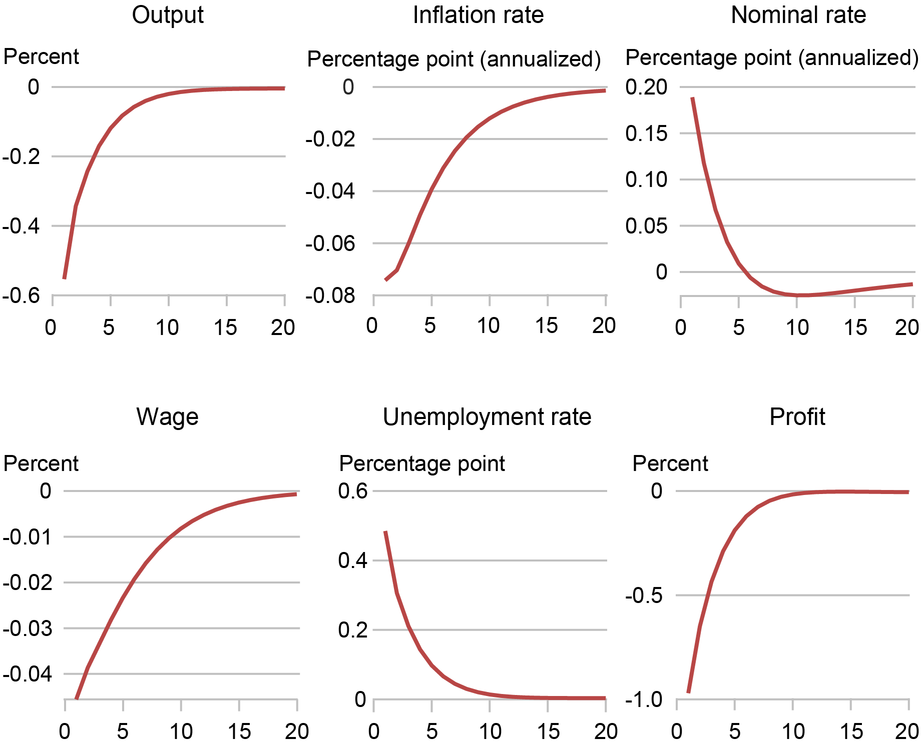
Notes: Time is in quarters on the x-axis.
The next chart displays the distributional consequences of the policy shock, shown for households in the bottom (B1 and B10) and top (T1 and T10) 1 percent and 10 percent of the wealth distribution, as well as for the five quintiles (Q1 through Q5) of the wealth distribution. For each quantile of the wealth distribution, the effect of the policy shock on the household’s welfare is measured in consumption equivalent terms. That is, each household belonging to a given quantile of the wealth distribution is asked how much consumption they would be willing to forgo forever in order to avoid the consequences of the shock. The result is then averaged across all households belonging to that quantile. The black lines measure the total effect, while the colored bars decompose the total into components due to 1) the increase in the real interest rate, and the decline in 2) labor income/wages, 3) profits, 4) the job finding rate, and 5) equity prices (see Lee 2024 for details on how the decompositions are computed).
The Consequences of Monetary Policy Shocks Are Greater for the Poorest Households
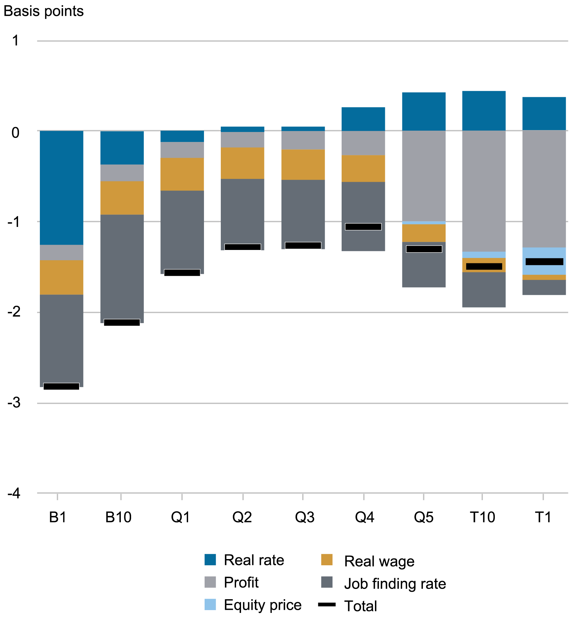
Notes: B1 and B10 and T1 and T10 are the bottom and top 1 percent and 10 percent of the wealth distribution, respectively. Q1 through Q5 are the bottom to top five quintiles of the wealth distribution. The shocks are decomposed into component parts.
The results show that the poorest households suffer the most from the interest rate hike. This is because the rise in rates increases their financial burden to the extent that they are debtors. Moreover, poor households’ primary source of income is labor, and the decline in the job finding rate and the associated increase in unemployment also hurt them considerably. As we move up the wealth distribution, the effect of higher interest rates switches sign: it is close to zero for households in the middle of the distribution, as they have little wealth, and becomes positive for rich households. However, rich households also derive a substantial fraction of their income from profits, and hence they are hurt by the fall in profits. In fact, the overall impact of the shock is (inverted) U-shaped, with poor and very rich households being affected the most, although the bottom 1 percent of households are almost twice as badly affected, in consumption equivalent terms, as the top 1 percent.
This U-shaped pattern is broadly consistent with the growing empirical literature on the distributional effect of monetary policy shocks, which generally finds that expansionary shocks disproportionally benefit low-income households, by increasing their employment, and the very rich, by increasing capital income, and vice versa for contractionary shocks. Using Swedish data, Amberg et al. (2022) find that expansionary shocks increase income the most for households in the highest and lowest income deciles; this is driven by labor income for the lowest decile, and capital income for the highest. Using Norwegian administrative data, Holm et al. (2021) find that contractionary monetary policy shocks decrease consumption the most, at two- through five-year horizons, for households in the highest and lowest levels of the liquid wealth distribution.
The Distributional Consequences of Inflationary Cost Push Shocks
The chart below shows the responses of aggregate variables to a one standard deviation inflationary cost push shock. As standard in the New Keynesian literature, we model this shock as an increase in firms’ desired markup originating from a decline in the substitutability across products. This fall in competitiveness leads to prices rising. The red lines show the response under the estimated policy reaction function, and the blue lines show the responses obtained under an alternative reaction function that responds more aggressively to inflation.
Responses to Cost Push Shocks: Aggregate Variables
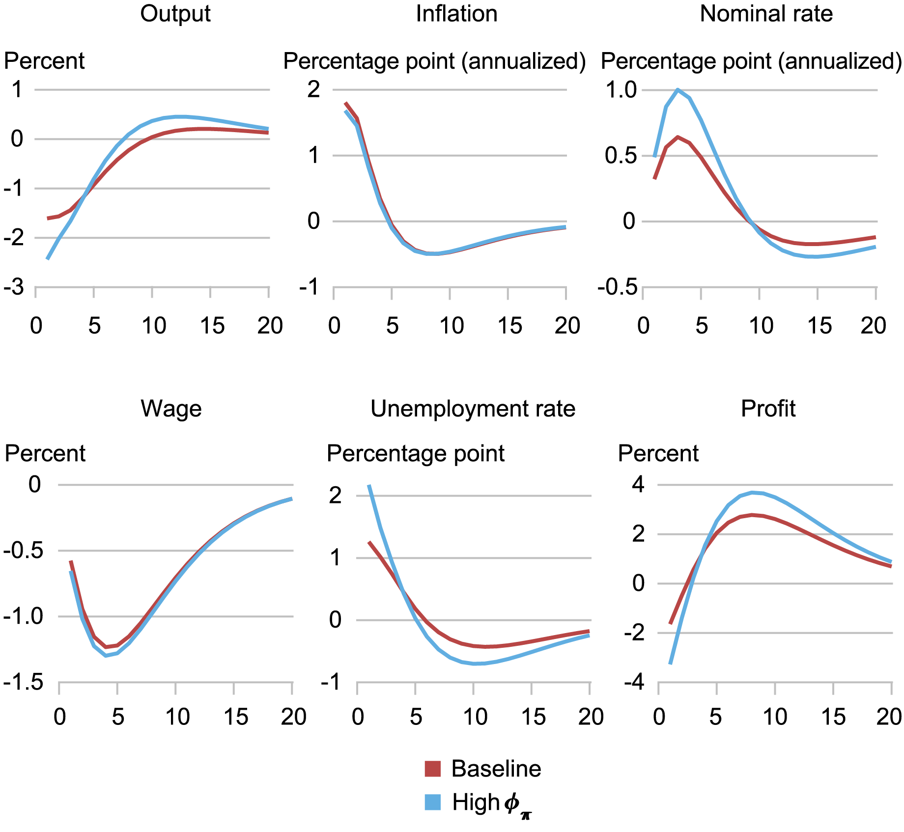
Notes: Time is in quarters on the x-axis. The baseline inflation coefficient is 1.8. It rises to 3.0 in the high φπ scenario.
Focusing on the red lines first, we see that the shock generates a sizable response of inflation, which rises by almost 2 percentage points, a 1.5 percent decline in output, and a deterioration in the labor market, with unemployment rising more than one percentage point and real wages falling by more than 1 percent after one year and remaining depressed throughout the forecast horizon. While unemployment rises on impact and for the first year after the shock, it falls below steady state afterwards because real wages are low and firms therefore find it attractive to post vacancies. Profits decline on impact in spite of the higher desired markup because of the fall in economic activity. Profits rebound soon after, however, because labor costs remain low. As we will see, the path of profits is key for understanding the distributional impact of cost push shocks. The blue lines show the impact under a more aggressive response to inflation: specifically, the coefficient on inflation φπ in the Taylor-like reaction function is raised from its estimated value of 1.8 to 3.0. When policy responds more aggressively to inflation, inflation rises less following the cost push shock, but the differences are small due to the very flat Phillips curve. The output and labor market costs of containing inflation are conversely large, with output falling by almost 1 percent more than under the baseline rule and unemployment also rising by about 1 percentage point more.
The next chart shows the distributional consequences of cost push shocks. The message from the illustration is clear: most households except for the very rich lose substantially following a positive cost push shock. This loss is due to the fact that real wages fall substantially in the aftermath of the shock and this hurts households, especially if they are hand-to-mouth. Arguably, this what Fed Chair Jerome Powell has been referring to in his press conferences over the past couple of years, such as in June 2024, when stating that “high inflation imposes significant hardship as it erodes purchasing power, especially for those least able to meet the higher costs of essentials….” Very rich people gain from the shock, however. This is because they accrue all the extra profit that the low cost of labor implies after the first few quarters.
The Distributional Consequences of Cost Push Shocks
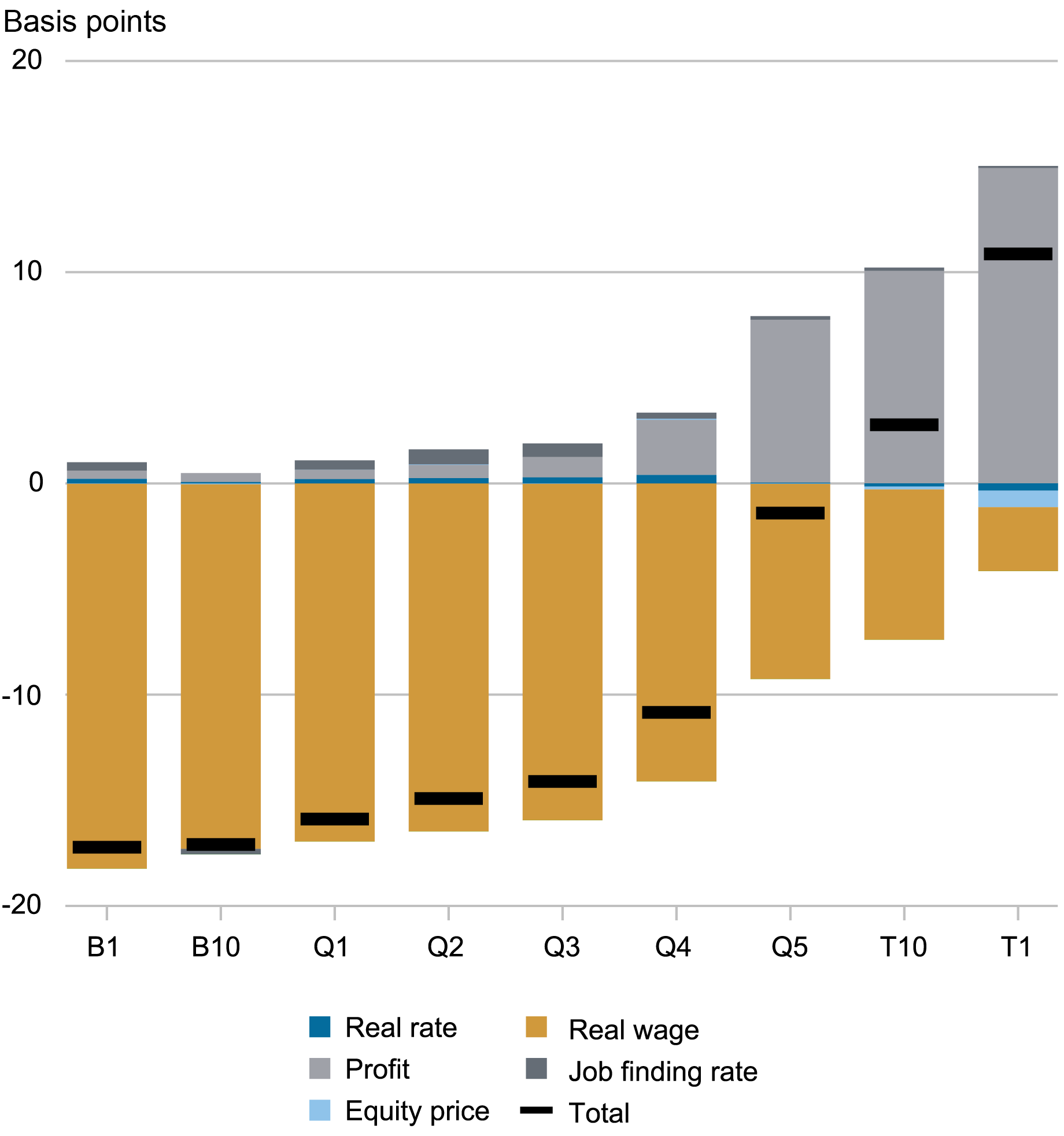
Notes: B1 and B10 and T1 and T10 are the bottom and top 1 percent and 10 percent of the wealth distribution, respectively. Q1 through Q5 are the bottom to top five quintiles of the wealth distribution. The shocks are decomposed into component parts.
The chart below shows the distributional consequences of a stronger policy response to cost push shocks, that is, the difference between the distributional consequences of these shocks (computed as above) under φπ equal to 3 and φπ equal to 1.8. The lesson from this illustration is that if poor households are those that are most negatively affected by the cost push shock, they are even more negatively affected if the central bank tries to fight inflation more aggressively. This is because the more aggressive policy implies higher interest rates, which hurts households that are in debt. Households with wealth conversely benefit from the rise in real rates. On the whole, these households are not much affected by the more aggressive policy as their higher financial income is offset by lower labor income. Nonetheless, very rich households are also hurt by the more aggressive response to inflation as this reduces profits.
The Distributional Consequences of a Stronger Policy Response to Cost Push Shocks
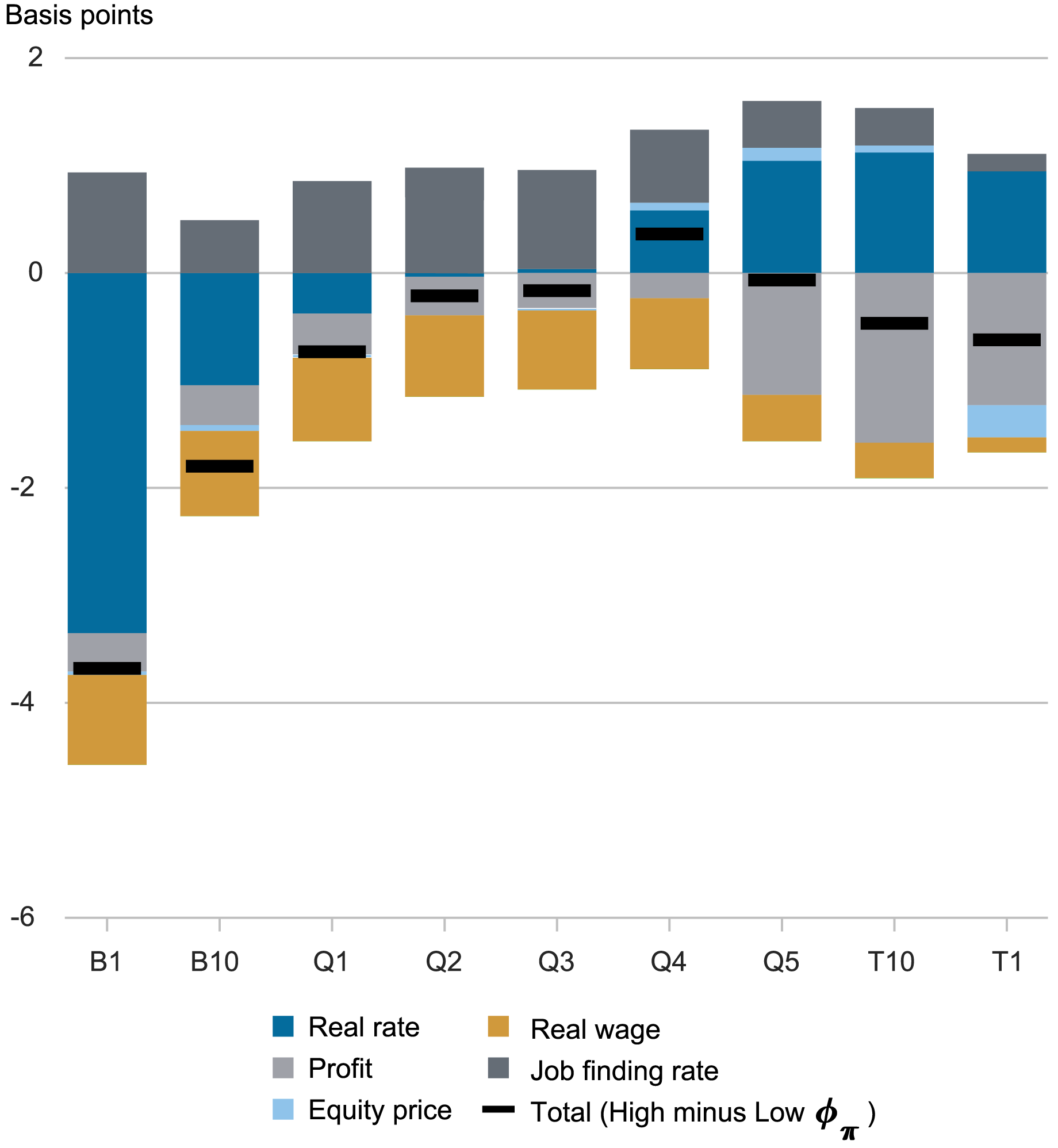
Notes: B1 and B10 and T1 and T10 are the bottom and top 1 percent and 10 percent of the wealth distribution, respectively. Q1 through Q5 are the bottom to top five quintiles of the wealth distribution. The shocks are decomposed into component parts.
Summing Up
The distributional effects of inflation, when the source of inflation is a cost push shock, are very uneven across the wealth distribution: the poor lose while the very rich benefit. The source of these losses and gains is the decline in real wages which hurts hand-to-mouth households especially, as it translates almost one to one into a decline in consumption. At the same time, the falling labor costs translate into increases in corporate profits and benefit the very rich who receive these profits.
Yet while inflation hurts the poor the most when viewed through a distributional lens, disinflationary policies hurt them even more. That is, an aggressive policy response to a cost push shock leads to a further deterioration in the labor market together with higher interest rates, which make debt more expensive. If the Phillips curve is flat, as it is in this estimated model, the gains in taming inflation are limited and do not reverse these disadvantages for households at the bottom of the wealth distribution.

Marco Del Negro is an economic research advisor in Macroeconomic and Monetary Studies in the Federal Reserve Bank of New York’s Research and Statistics Group.

Keshav Dogra is a senior economist and economic research advisor in Macroeconomic and Monetary Studies in the Federal Reserve Bank of New York’s Research and Statistics Group.

Pranay Gundam is a research analyst in the Federal Reserve Bank of New York’s Research and Statistics Group.

Donggyu Lee is a research economist in Macroeconomic and Monetary Studies in the Federal Reserve Bank of New York’s Research and Statistics Group.

Brian Pacula is a research analyst in the Federal Reserve Bank of New York’s Research and Statistics Group.
How to cite this post:
Marco Del Negro, Keshav Dogra, Pranay Gundam, Donggyu Lee, and Brian Pacula, “On the Distributional Effects of Inflation and Inflation Stabilization,” Federal Reserve Bank of New York Liberty Street Economics, July 2, 2024, https://libertystreeteconomics.newyorkfed.org/2024/07/on-the-distributional-effects-of-inflation-and-inflation-stabilization/.
Disclaimer
The views expressed in this post are those of the author(s) and do not necessarily reflect the position of the Federal Reserve Bank of New York or the Federal Reserve System. Any errors or omissions are the responsibility of the author(s).


